


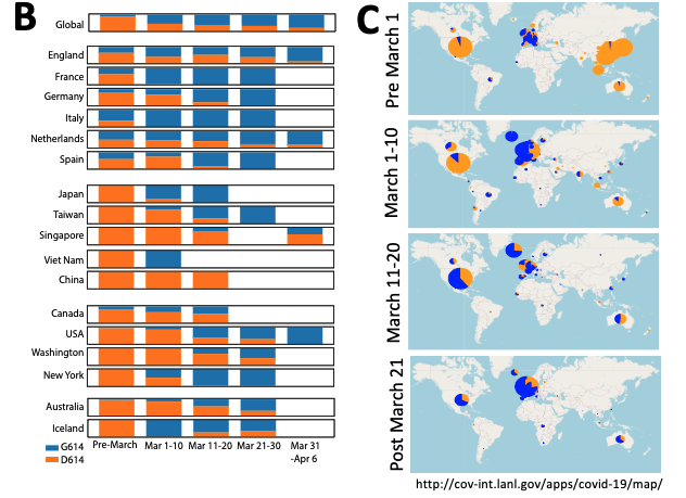
Bar charts illustrating the relative frequencies of the original Wuhan form (D614, orange), and the form that first emerged in Europe (G614, blue)based on the numbers in part (A). A variation of this figure showing actual tallies rather than frequencies, so the height of the bars represent the sample size, is provided as Fig. S2. C)A global mapping of the two forms illustrated by pie charts over the same periods. The size of the circle represents sampling. An interactive version of this map of the April 13th data, allowing one to change scale and drill down in to specific regions of the world is available at https://cov.lanl.gov/apps/covid-19/map, and updates of this map based on contemporary data from GISAID are provided atwww.cov.lanl.gov. (Source: Korber et al., Pre-Print)
Disclaimer: This is a summary of an article that is a preprint and has not been peer reviewed.
In a recent pre-peer reviewed bioRxiv manuscript, Bette Korber and colleagues have used a newly developed analysis pipeline to track mutations in the Spike protein; being the target of drug and vaccine development. They identified 14 accumulating mutations, revealing an early warning signal to viral variants that may confer selective advantages in transmission or resistance to drugs or vaccines. The authors raise the concern of one specific mutation – D614G (a G-to-A base change at position 23,403 in the Wuhan reference strain) in Spike – which began spreading in Europe in early February 2020 and when introduced into new geographic regions, the variant rapidly spread to become the dominant virus. The D614G mutation may “impact Spike’s infectivity” by improving receptor binding, fusion activation, or antibody-dependent enhancement (ADE) elicitation. ADE is where antibodies specific for the epitope containing the D614G variant promotes viral entry into cells that do not necessarily express ACE2 receptors. The authors conclude “understanding both how the D614G mutation is overtaking the pandemic and how recombination is impacting the evolution of the virus will be important for informing choices about how best to respond in order to control epidemic spread and resurgence.”
Journal Article: Korber et al., Spike mutation pipeline reveals the emergence of a more transmissible form of SARS-CoV-2. BioRxiv Preprint
Article by Clive Gray